|
Hi there! Nice to meet you!I'm Olivia, an Apex High School senior. This is where I will document all of my art projects throughout my semester in art 2. I hope you enjoy and explore my page!
|
Artist painting
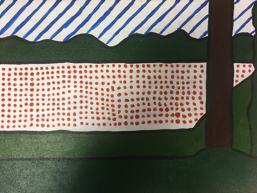
1- Roy Lichenstein
2- Colors he used
3- His style
4- His inspiration
2. My craftsmanship is very neat since I used a ruler to draw all the lines and and planned everything out before I started painting. Since I researched Roy and came across his style and inspirations I copied his comic book style.
3. The most difficult part of this project was keeping the orange dots all in a straight line and matching the dots around it.
4. My color choices matched Roys common color choices. I made my painting look very basic with black paint outlining everything since Roy tended to do that in all of his paintings.
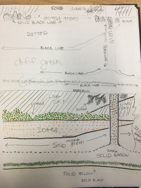
5. The style of my landscape is basic and very comic like since Roys inspiration and paintings were comic like. He used dots and lines to show texture and solid black lines to outline everything.
6. I feel like Roy would know I copied his art style but I feel like he's a snotty man and would trash my whole piece and critique everything.
7. If I could start over and do something differently I would make the greens completely different shades so they don't look so similar.
2- Colors he used
3- His style
4- His inspiration
2. My craftsmanship is very neat since I used a ruler to draw all the lines and and planned everything out before I started painting. Since I researched Roy and came across his style and inspirations I copied his comic book style.
3. The most difficult part of this project was keeping the orange dots all in a straight line and matching the dots around it.
4. My color choices matched Roys common color choices. I made my painting look very basic with black paint outlining everything since Roy tended to do that in all of his paintings.
5. The style of my landscape is basic and very comic like since Roys inspiration and paintings were comic like. He used dots and lines to show texture and solid black lines to outline everything.
6. I feel like Roy would know I copied his art style but I feel like he's a snotty man and would trash my whole piece and critique everything.
7. If I could start over and do something differently I would make the greens completely different shades so they don't look so similar.
Artist sketches
Roy lichenstein
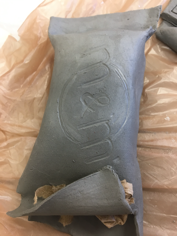
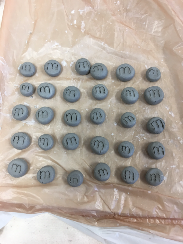
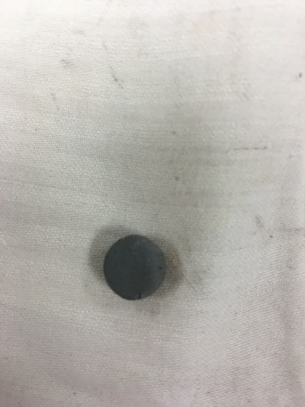
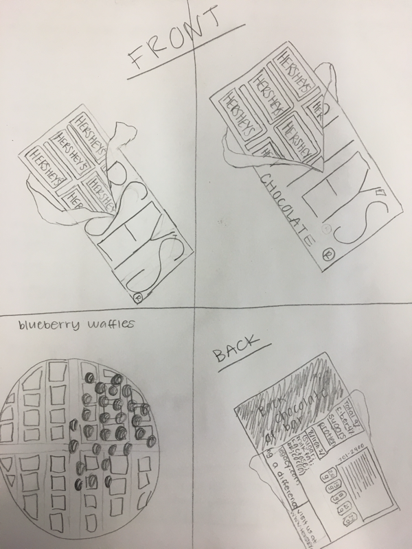
Clay final
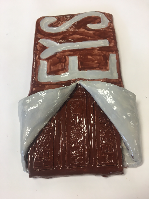
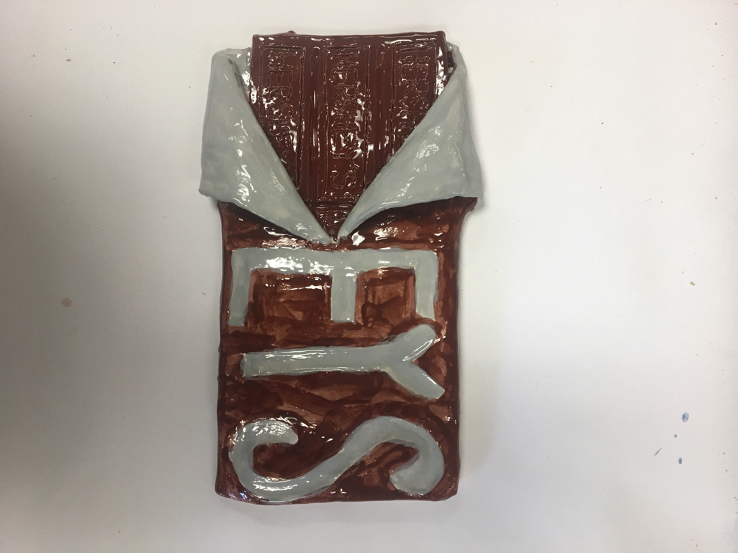
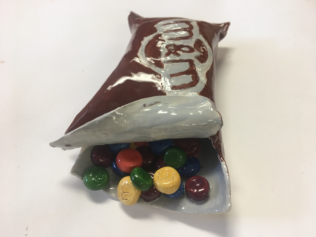
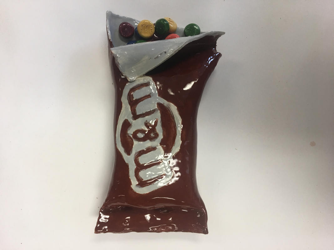
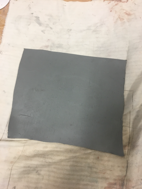
1- I think my craftsman ship for both of my pieces was executed well with the shapes and the words. My painting job on the top of the m&m bag was a little messy but it was very hard to paint.
2- The most difficult part of this project was painting the m&m bag because the letters on the top were very hard. It was difficult to keep the paints from over lapping.
3- My color choices show the colors of both wrappers, inside and out. The m&ms turned out very good and look like actual m&ms. I like how they turned out.
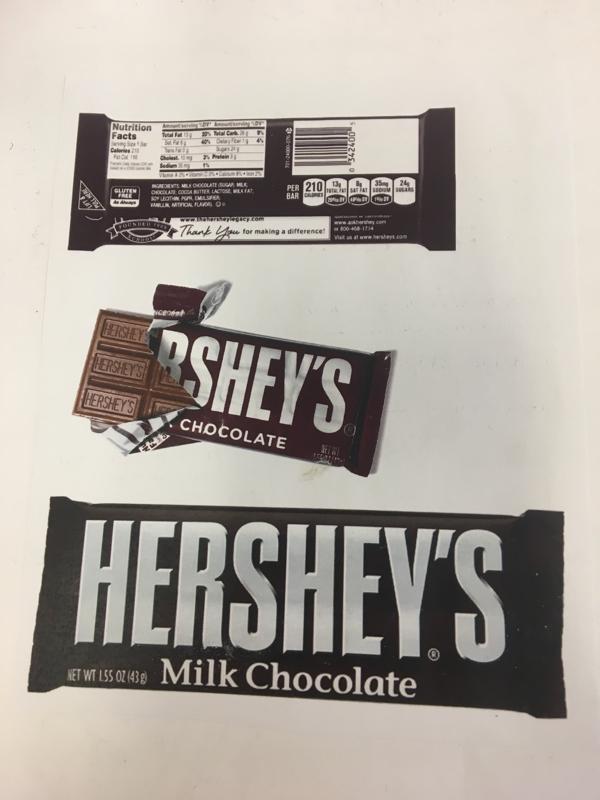
4- My m&m sculpter is interesting to look at because you can look inside the bag and see all the m&ms spilling out. My Hershey's chocolate sculpter is pretty cool because it looks like a giant chocolate bar even though the chocolate looks a little too dark.
5- A sculpter is different because you have to remember the sizes of the objects and make sure everything forms together well. The m&ms add a very nice touch because it makes the bag look real. 2D is different since it's not a whole sculpter that looks real life and you can physically hold both of my pieces
6- I created texture with my m&ms by drawing a tiny "m" on each m&m. I think that was very cool and unique that I made the bag look like it was open and the m&ms were falling out. The hershey's bar has a lot of texture. The wrapper is also being opened and the chocolate is showing through. Each piece of chocolate has "Hershey's" written on it which adds a unique touch.
7- Both of my pieces look like real food because my m&ms are painted to match their real colors and by having them pop out of the bag adds a realistic touch. My hershey's bar looks realistic since a hershey's bar has each individual piece of chocolate carved to make it easier to break. And each piece has "hershey's" carved on the top of them.
8- If I could do anything differently I would paint the chocolate on the hershey's bar a lighter color. I also would've made the m&m bag a little smaller since it's too fat.
2- The most difficult part of this project was painting the m&m bag because the letters on the top were very hard. It was difficult to keep the paints from over lapping.
3- My color choices show the colors of both wrappers, inside and out. The m&ms turned out very good and look like actual m&ms. I like how they turned out.
4- My m&m sculpter is interesting to look at because you can look inside the bag and see all the m&ms spilling out. My Hershey's chocolate sculpter is pretty cool because it looks like a giant chocolate bar even though the chocolate looks a little too dark.
5- A sculpter is different because you have to remember the sizes of the objects and make sure everything forms together well. The m&ms add a very nice touch because it makes the bag look real. 2D is different since it's not a whole sculpter that looks real life and you can physically hold both of my pieces
6- I created texture with my m&ms by drawing a tiny "m" on each m&m. I think that was very cool and unique that I made the bag look like it was open and the m&ms were falling out. The hershey's bar has a lot of texture. The wrapper is also being opened and the chocolate is showing through. Each piece of chocolate has "Hershey's" written on it which adds a unique touch.
7- Both of my pieces look like real food because my m&ms are painted to match their real colors and by having them pop out of the bag adds a realistic touch. My hershey's bar looks realistic since a hershey's bar has each individual piece of chocolate carved to make it easier to break. And each piece has "hershey's" carved on the top of them.
8- If I could do anything differently I would paint the chocolate on the hershey's bar a lighter color. I also would've made the m&m bag a little smaller since it's too fat.
Clay in progress
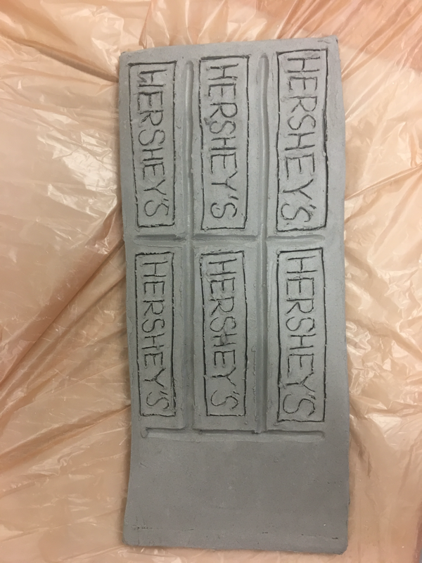
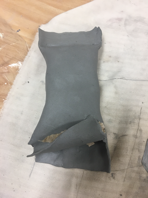
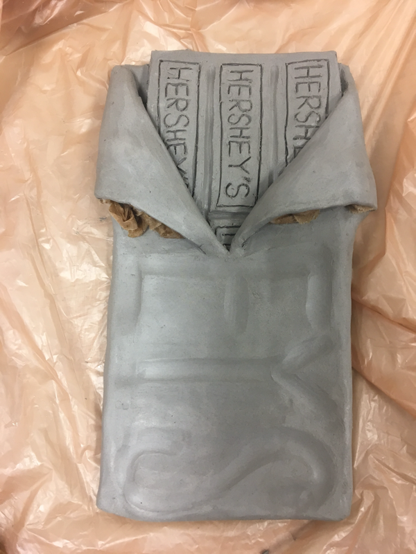
These are my in progress pictures of the hershey's bar and pack of m&ms.
Clay sketches and in progress pictures
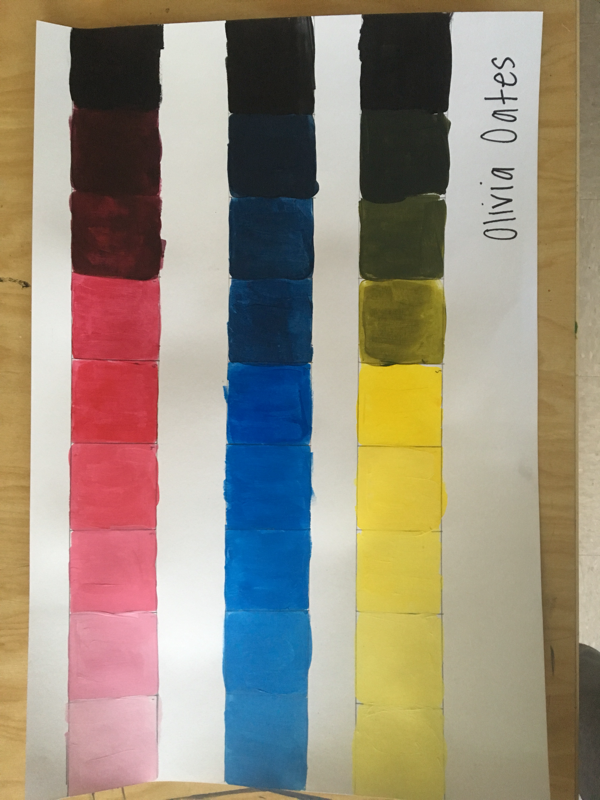
Acrylic paint
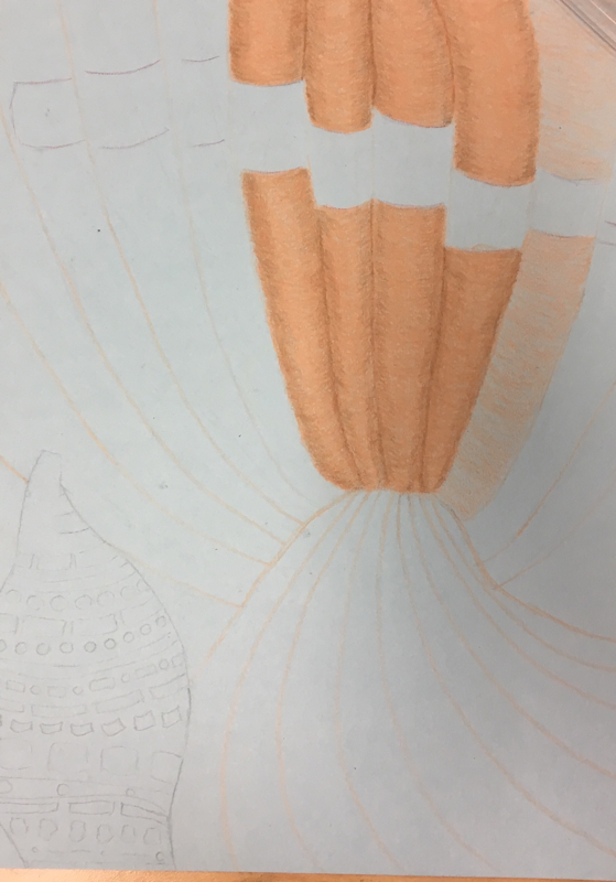
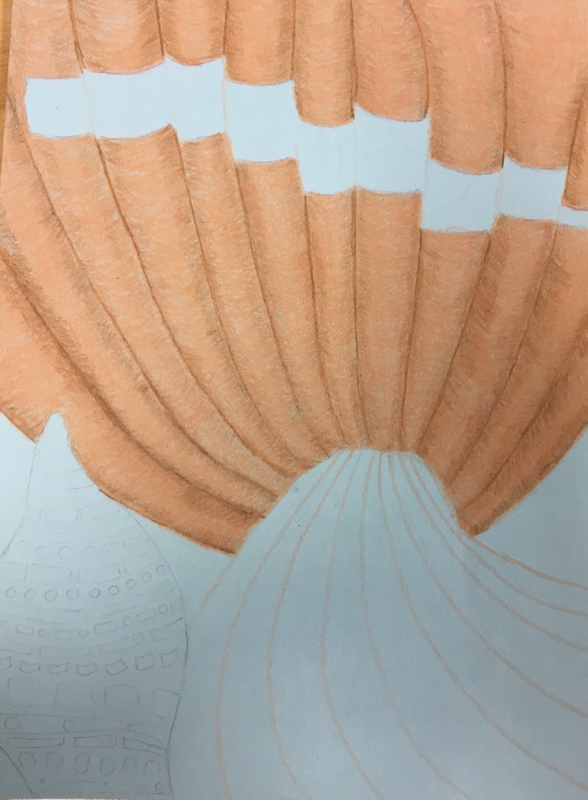
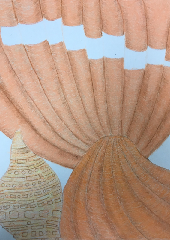
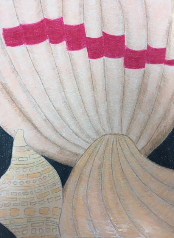
Color Wheel
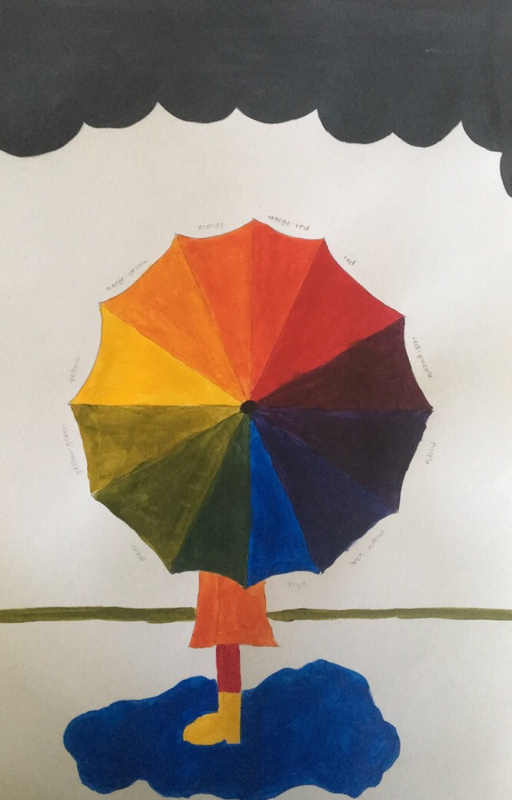
I chose to sketch and paint an umbrella to represent a color wheel because I felt like the individual folds on the umbrella would easily represent the different colors.
Prisma
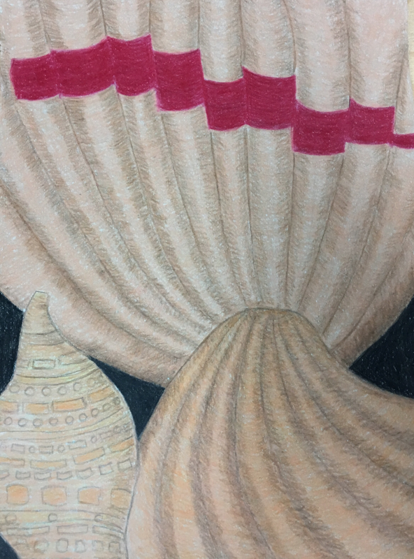
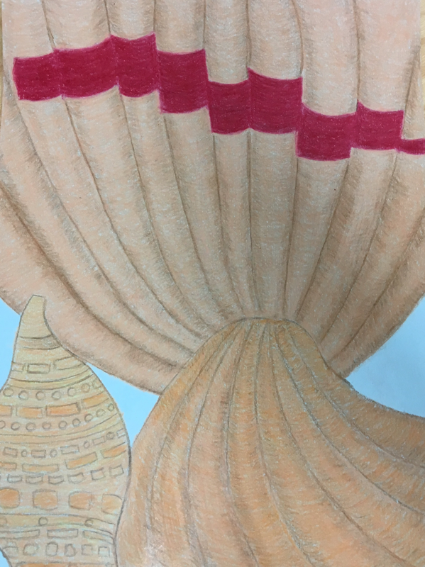
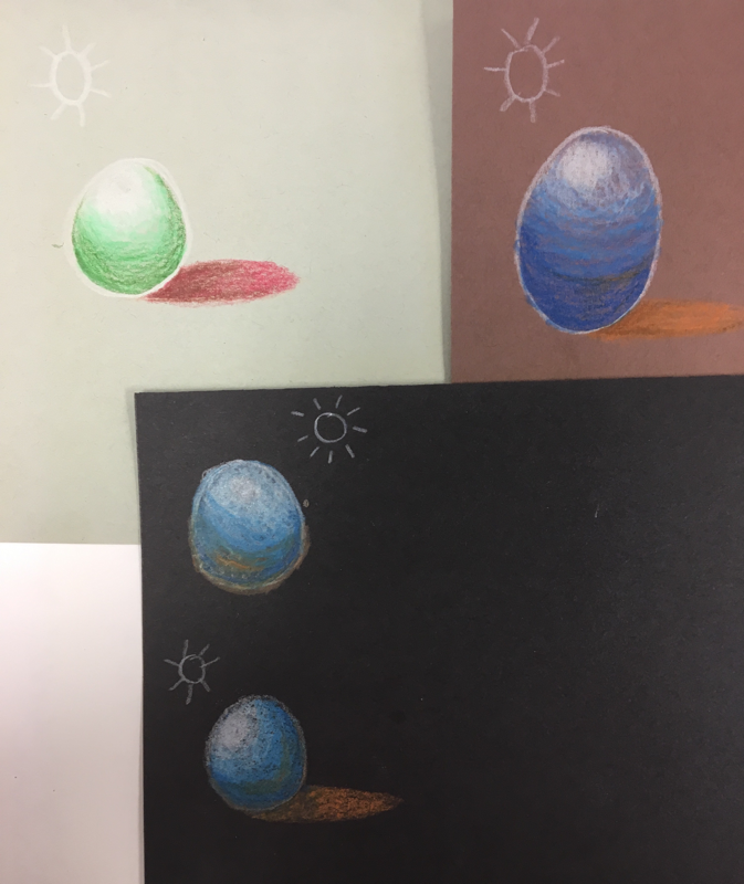
The 1- I believe these shells have pretty good crafsmanship. You can see the depth of the shells ridges and the texture in the crevasses.
2- Yes, I believe I used full range of values to create the illusion of depth. The darker brown shows how deep the ridges of the shells are and how the shells are actually rounded.
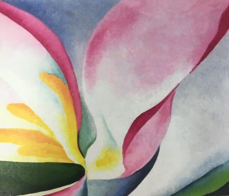
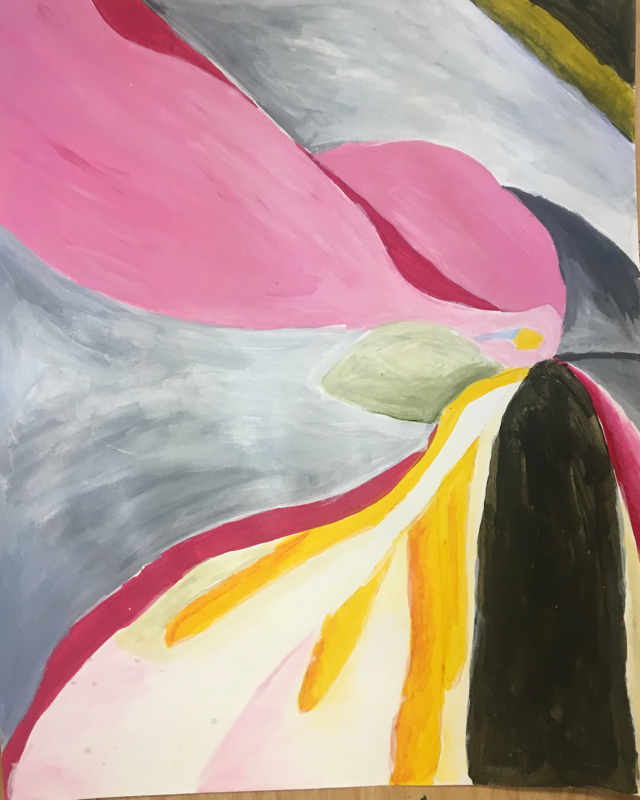
3- I represented the the style of Georgia O' Keeffe by zooming in and focusing on the texture and depth of a particular item. By focusing on different parts of 3 different shells shows the different textures of the shells.
4- I chose lighter colors and for the actual shell and used darker browns to show depth. I used red to add color to the one top shell and it also shows the shape of the shell. I really like my color choices.
5- These shells are all different and have different contrasts. They each have their own unique shape and colors. Even though they all look the same color, one has a more yellow look, one is more orange and one is more beige. They each have their own unique positioning, shapes, texture and designs.
6- Each shell has their own texture, especially the smaller shell in the bottom left corner. This shell has a different texture since it's a different type of shell. All the shells have different shadows depending on their positions. Two of them have the same shape and show shadows in the ridges and along the edges.
2- Yes, I believe I used full range of values to create the illusion of depth. The darker brown shows how deep the ridges of the shells are and how the shells are actually rounded.
3- I represented the the style of Georgia O' Keeffe by zooming in and focusing on the texture and depth of a particular item. By focusing on different parts of 3 different shells shows the different textures of the shells.
4- I chose lighter colors and for the actual shell and used darker browns to show depth. I used red to add color to the one top shell and it also shows the shape of the shell. I really like my color choices.
5- These shells are all different and have different contrasts. They each have their own unique shape and colors. Even though they all look the same color, one has a more yellow look, one is more orange and one is more beige. They each have their own unique positioning, shapes, texture and designs.
6- Each shell has their own texture, especially the smaller shell in the bottom left corner. This shell has a different texture since it's a different type of shell. All the shells have different shadows depending on their positions. Two of them have the same shape and show shadows in the ridges and along the edges.
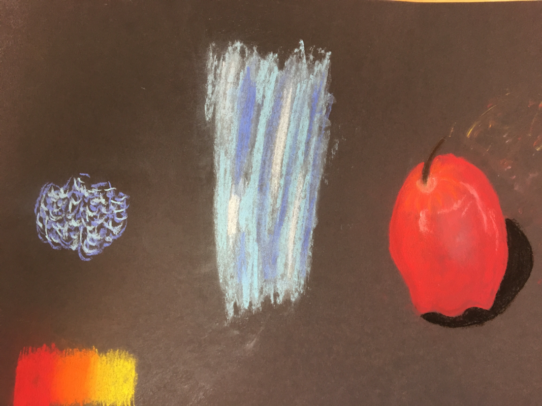
Pastel Practice
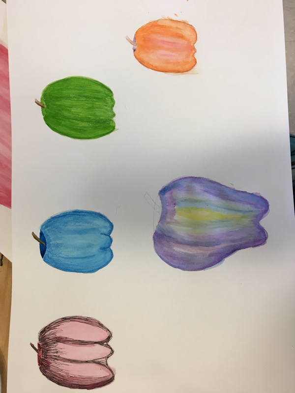
Prisma color final
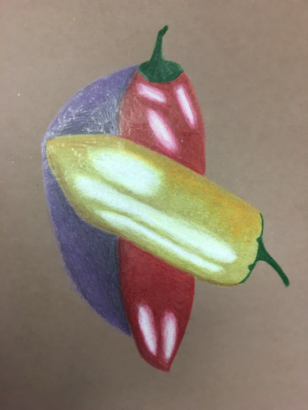
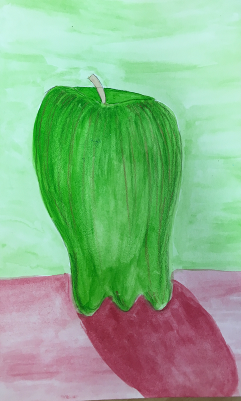
I used prisms colored pencils to draw these two peppers. I used a brown back ground and my red and yellow peppers have several highlights and a purple shadow. I'm satisfied with my peice, especially with this being my first ever colored pencil drawing!
Prisma color practice
Apple watercolor
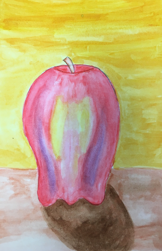
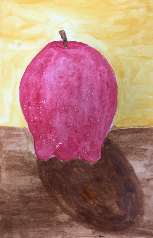
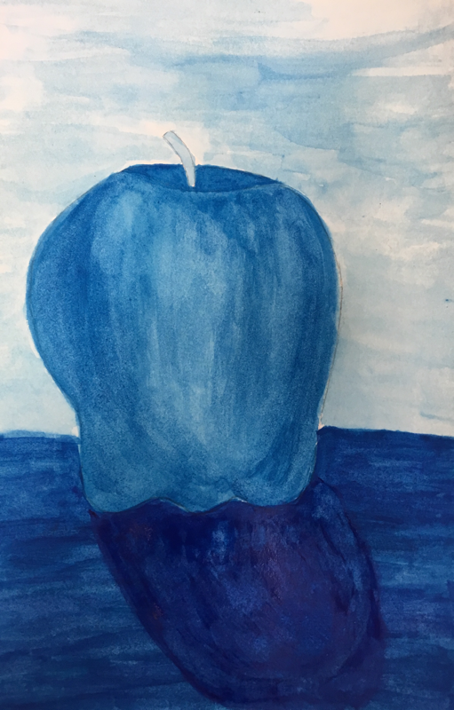
These are my 4 watercolor apples. The all blue in the bottom corner is my monochromatic apple. I used different shades of blue to create the background, table, apples and the shadow. The red apple in the bottom corner I used all warm colors with salt to create a different texture. The apple in the top left corner I used complimentary colors with traditional colored pencils. The apple is green so I used red in the background to compliment the apple. The darker green and red on the apple (colored pencil) adds to and finishes off the apple. Lastly, the apple in the top right corner I used all warm water color pencils. I really like water color pencils because I feel like I have more control over the colors.
Water colors
Final pen and ink
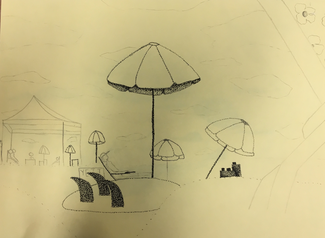
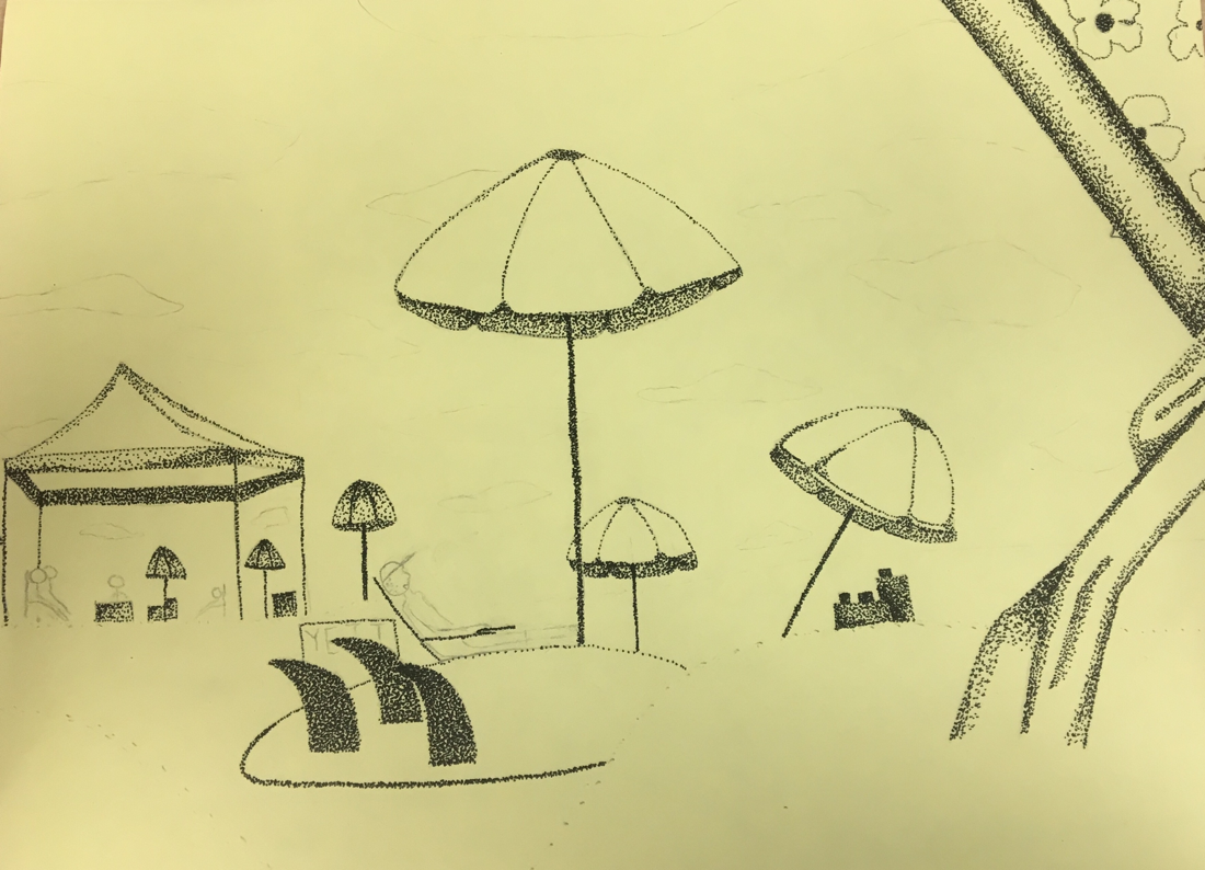
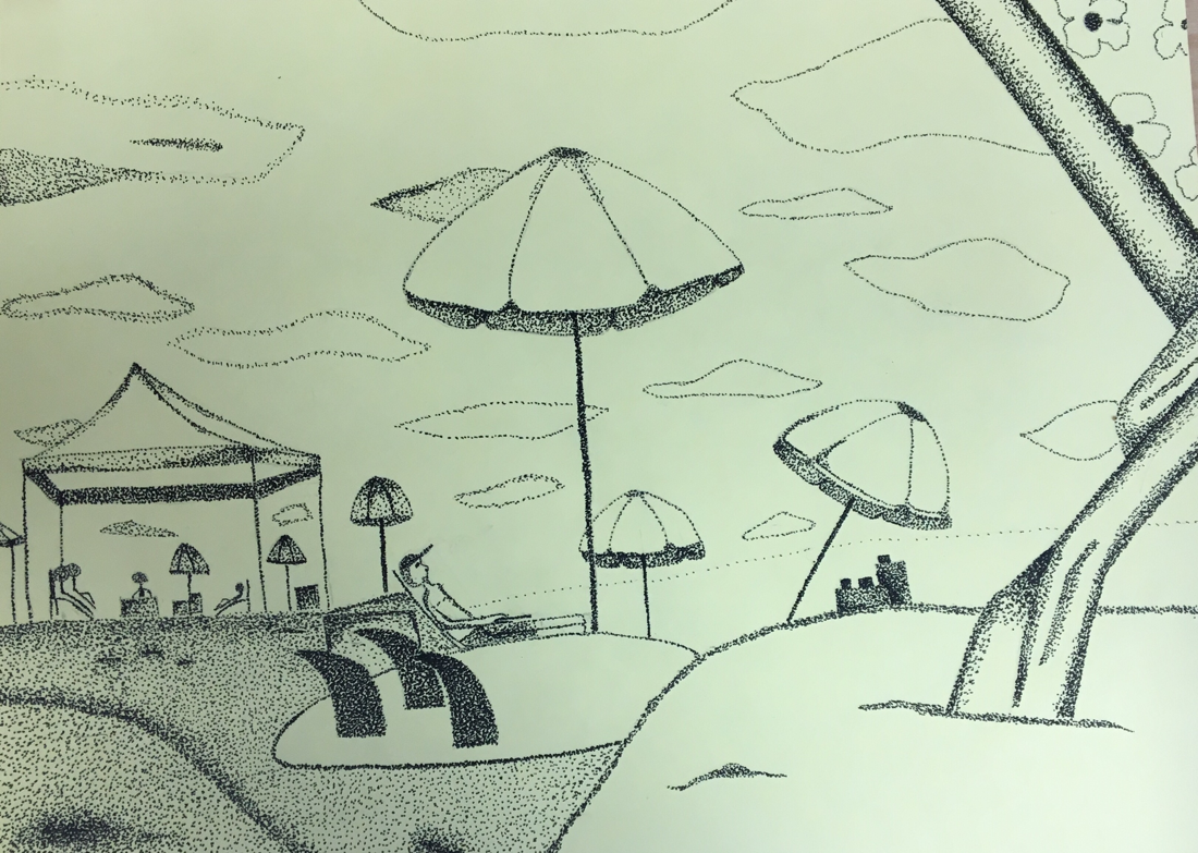
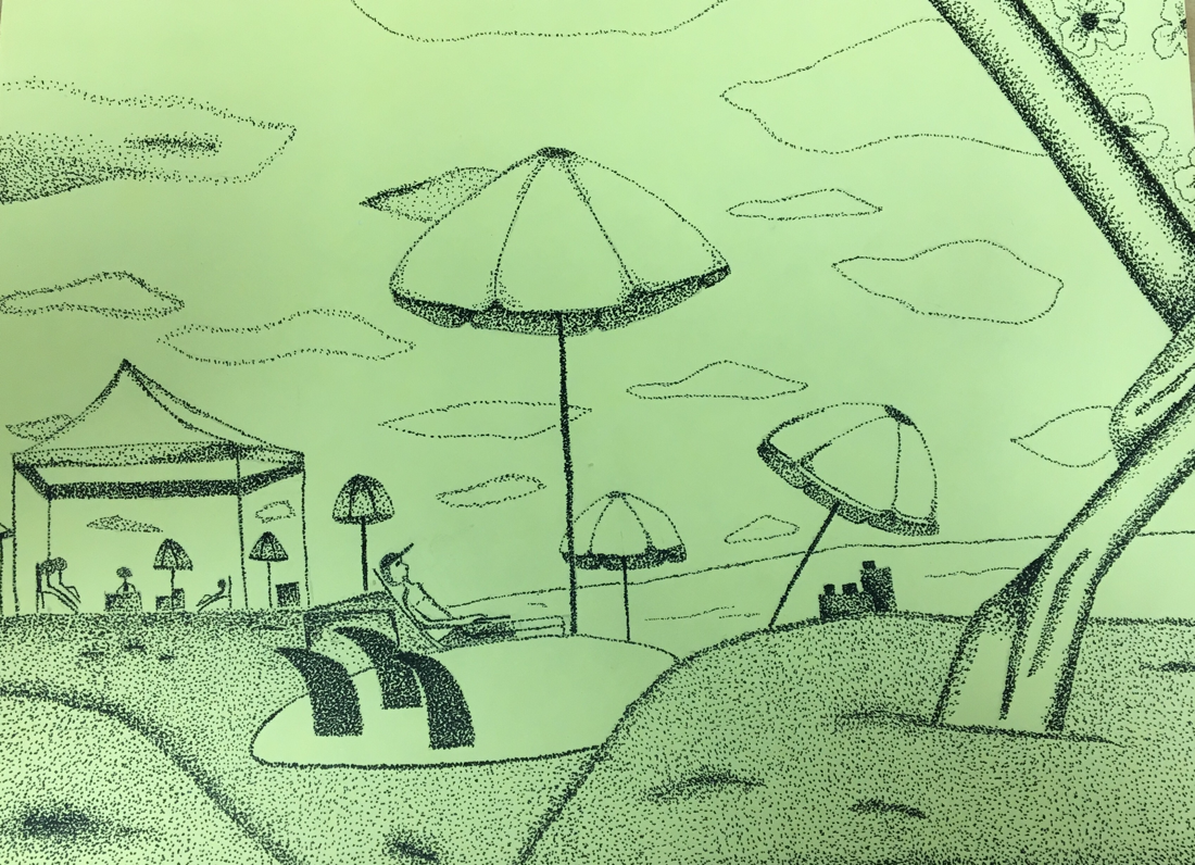
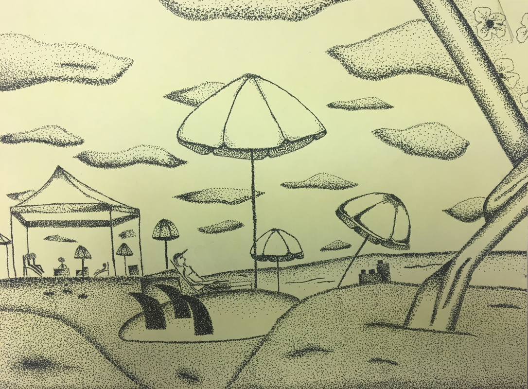
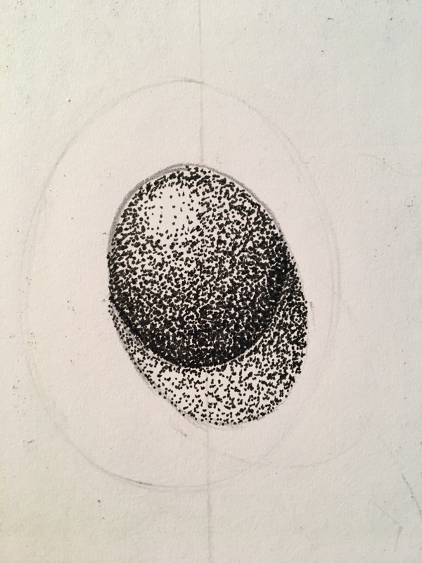
1- I decided to use stippling because I knew I could add texture and shade better. I stuck with sticking throughout my whole piece and I really like my decision.
2- Perspective is important because you can see the depth of the umbrellas and how far away they are. The clouds also show and water in the back also show perspective.
3- Texture is important because it shows you the depth of the umbrellas and shows you where the sand, surf board and water meet in different areas. If I didn't show texture you wouldn't be able to tell where one ends and another starts.
4- Value is very important because it shows the difference between the umbrellas and different values of them. For example, I used a darker value to show the back part of the umbrella peaking through.
5- My craftsmanship is very precise. By using stippling throughout my whole piece enhanced my craftsmanship as well.
6- If I could start over I would use a darker value on the sand and add more stippling throughout my piece.
8- Its important to understand the concepts of pen and ink because all of these techniques when not used correctly can look horrible. If you stipple to fast, the dots will start to look like commas and take away from your whole piece.
9- I have learned to add value throughout your piece and that the little things actually change a lot. I've also learned many new pen and ink techniques that I can use on my future projects.
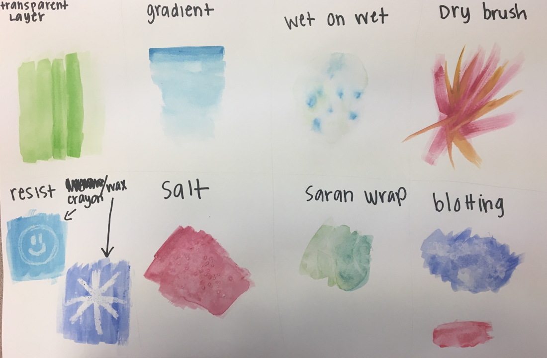
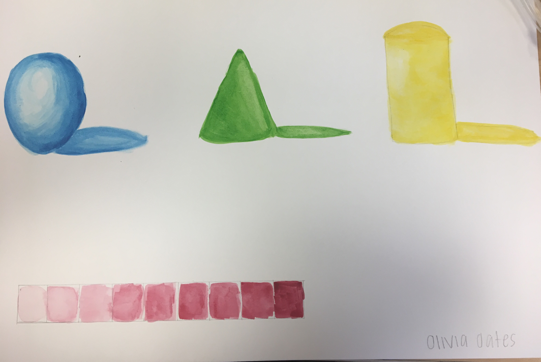
Pen and Ink techniques
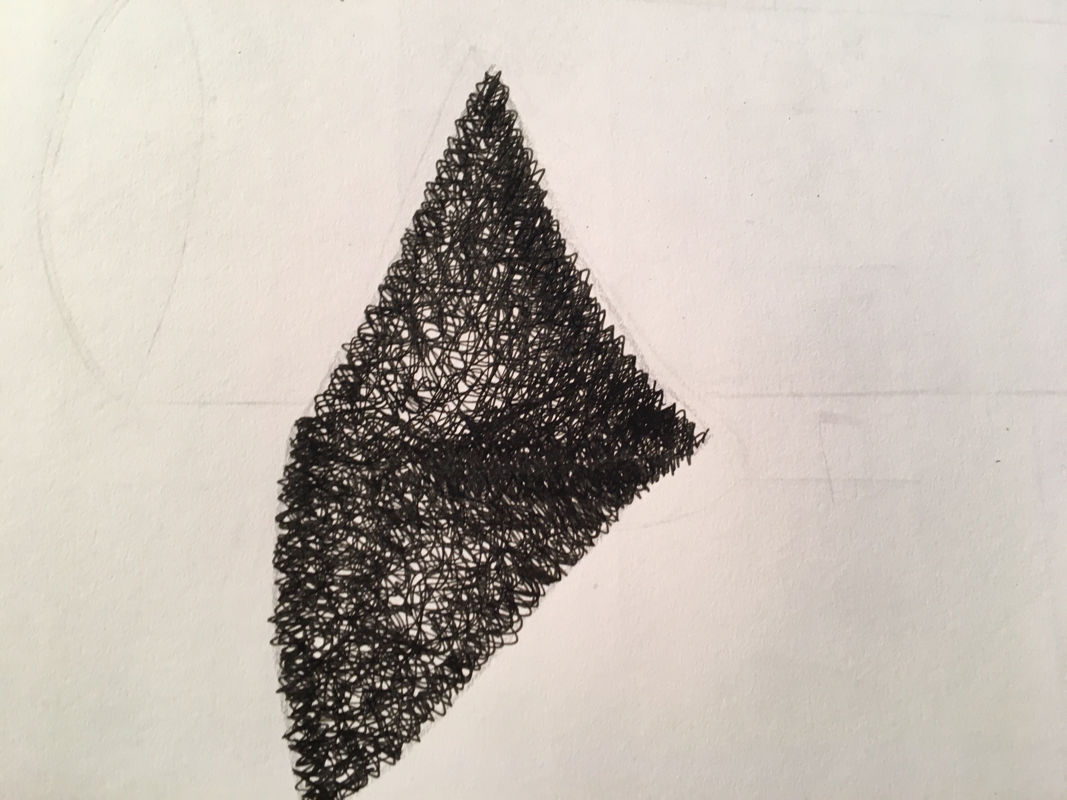
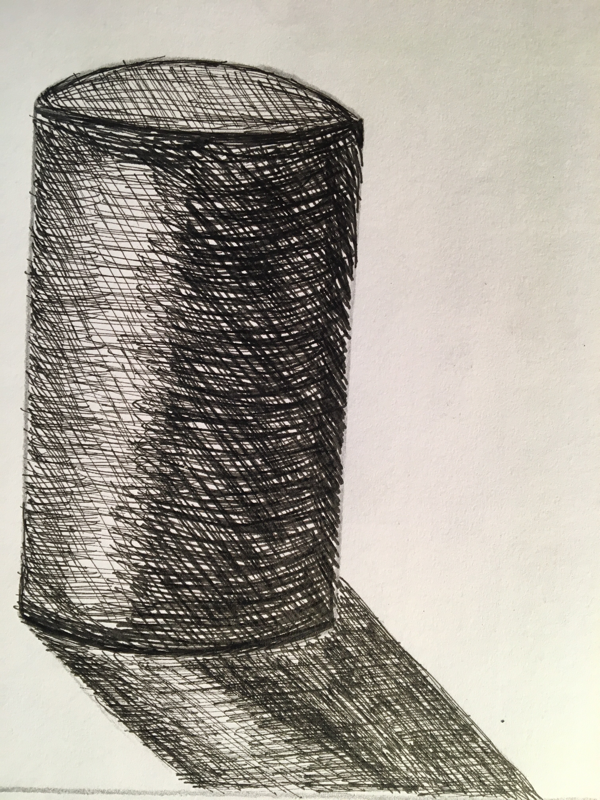
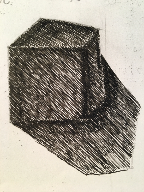
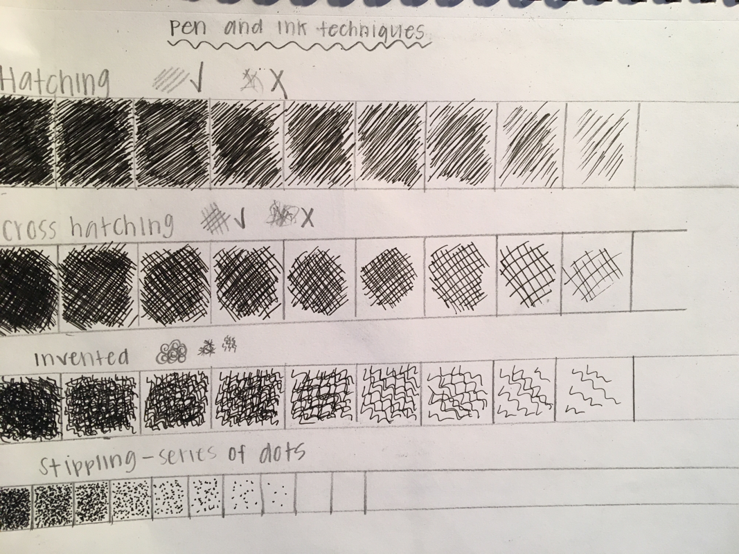
Pen and ink techniques are very fun even though they can be very time consuming. I started off the techniques by learned how to shade and add darks and lights by using the chart. Then I picked a different technique for one of the shapes. I used hatching on the cube, stippling on the sphere, invented on the cone and cross-hatching on the cylinder.
Room corner
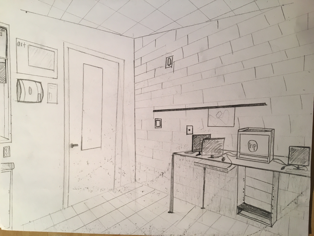
The corner room drawing was very hard because I had to base everything off the corner. Adding the floor and ceiling were very hard but once I got the hang of it, it all started to flow together.
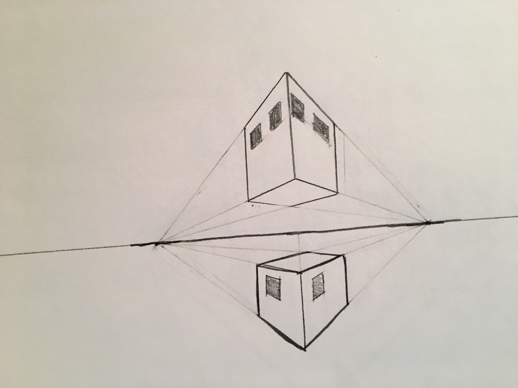
Three point perspective
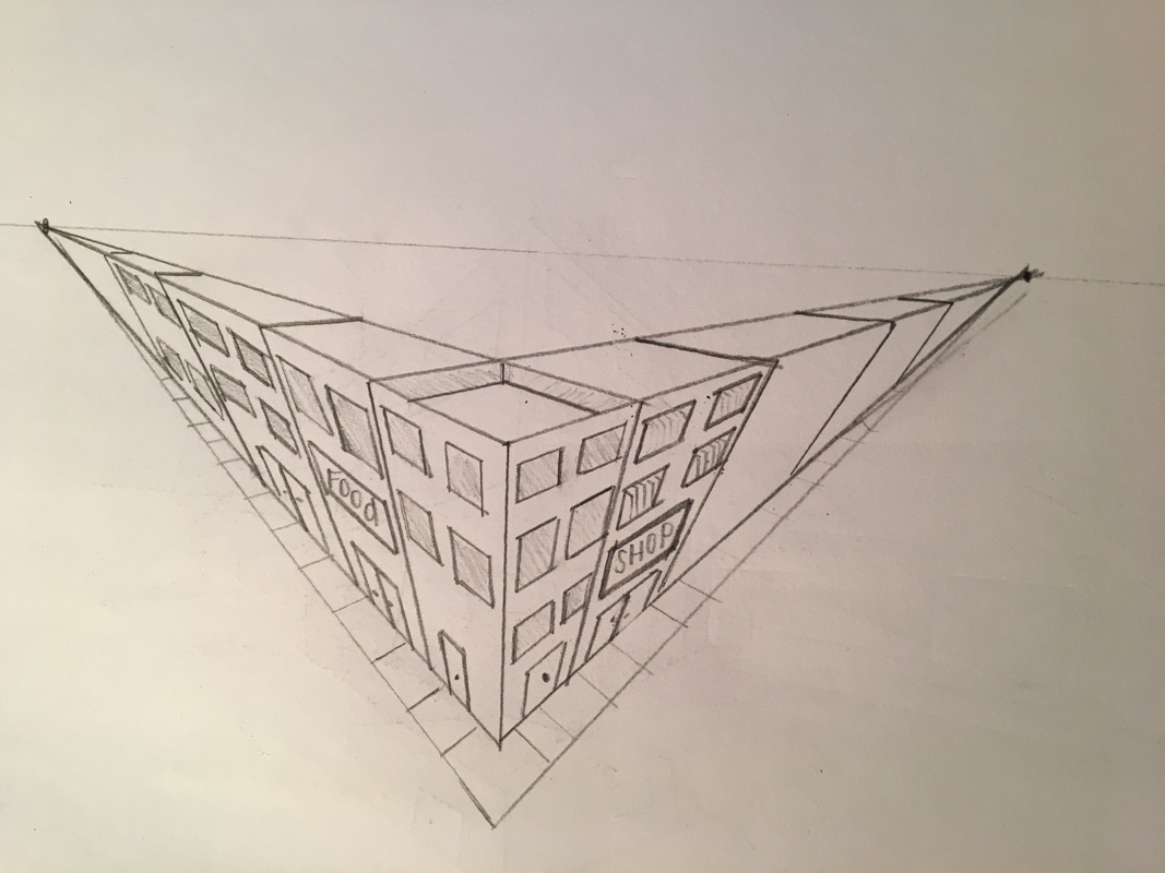
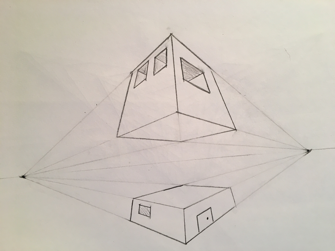
Three point perspective is a little different then the others. I learned how to draw 3 point on the right and used the skills I learned to draw the image on the left. Finally I added windows and doors ect.
Two point perspective
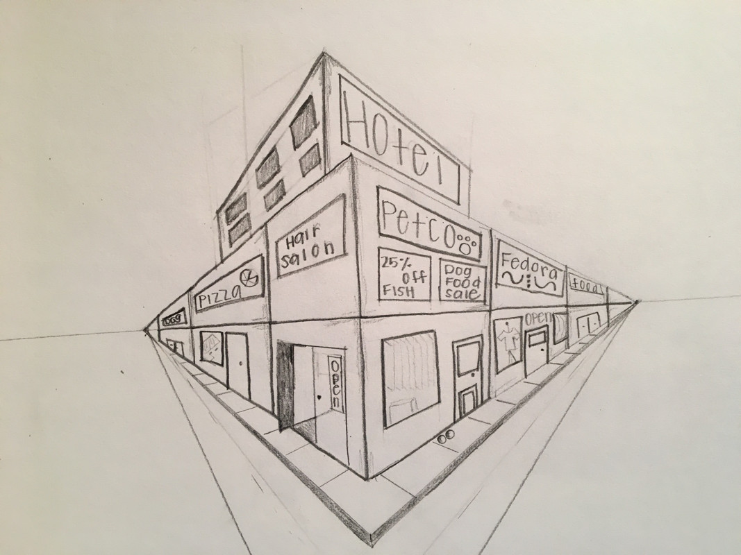
Two point perspective is a little harder than one point. I started off my drawing the image on the right and I learned how to draw the top half and bottom half of buildings. The image on the left shows how I put the bottom and top blocks on top of each other and created a building. I added windows and signs and even buildings in the back.
One point perspective
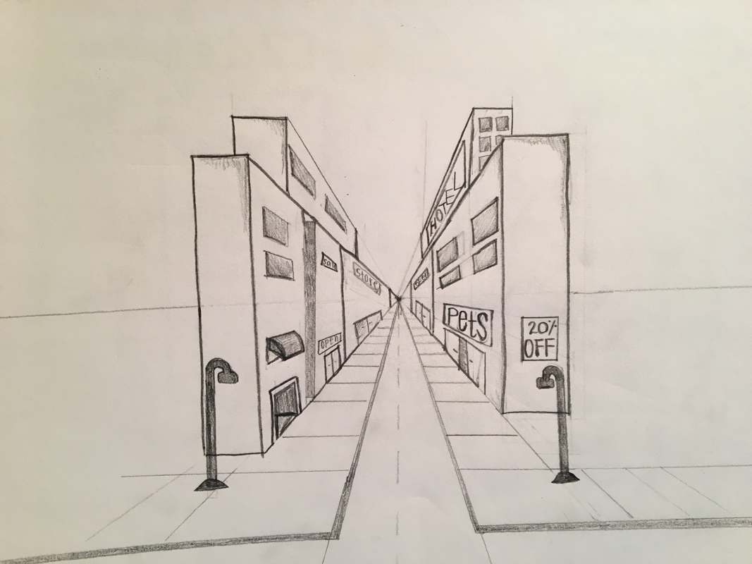
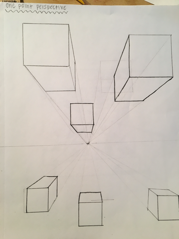
This is my one point perspective piece. I started off by drawing the image on the right and learning the technique and way to draw a one point perspective piece. Then I worked my way to drawing the image on the left and adding windows, signs, street lights, sidewalks etc.
Bottle Drawing
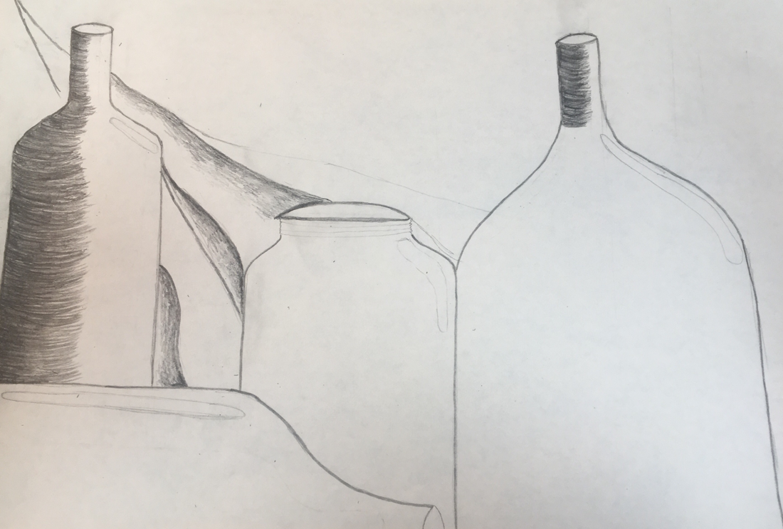
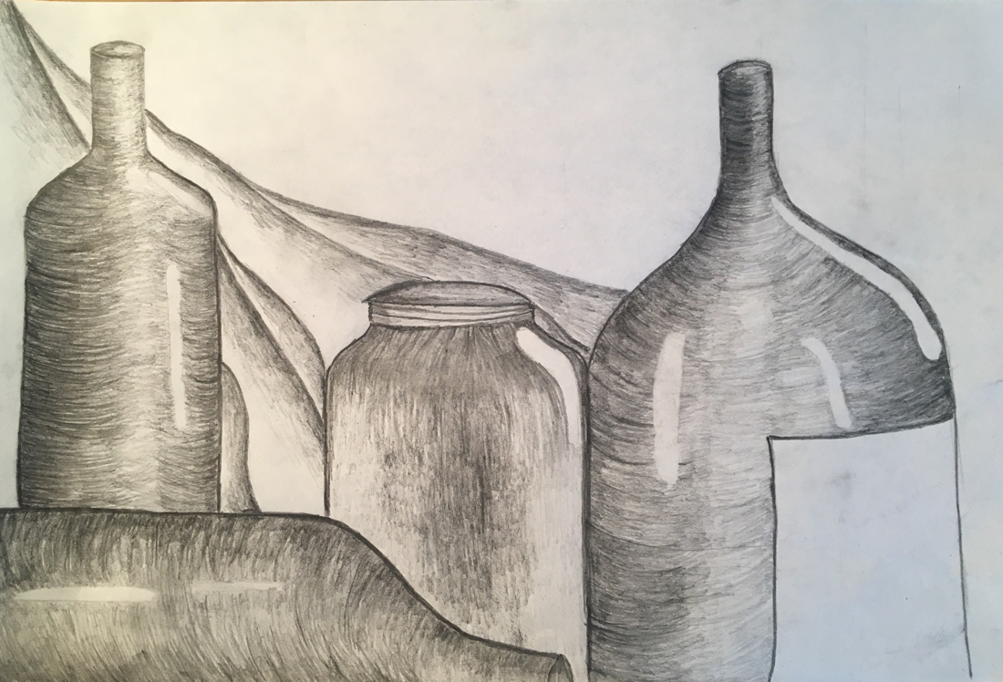
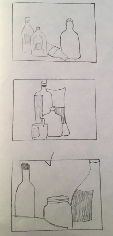
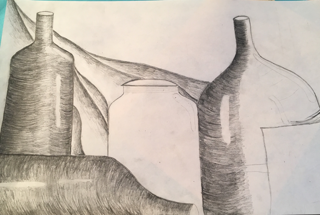
I arranged my composition to where I was able to fill an entire piece of paper with four different jars. Each jar is a different color, shape and size. I believe I have a good balance throughout my drawing because every jar flows to the next and the curtain behind my jars adds rhythm and unity. I believe my drawing has a successful composition.
I used many different values throughout my piece. Especially when I started highlighting and showing the values of the clear jar. This jar in particular was different from the rest because of the highlighting and shading (darker) is in the center rather than along the edges.
My knowledge of creating values throughout my piece made my drawing much better. I emphasized on the lightness, darkness and highlights of the jars.
Around the edges of the dark colored jars I started out by pressing down hard and lightening the pressure of my pencil the closer I got to the center of the jar. This helps us view the jar as round.
My interpretation of texture is essential because it shows the different textures and shades of the jars. This makes them come to life and look realistic.
If I could recreate my pieces I would flip my paper vertically so I could show more height of the jars. This would add more to my piece.
4 Drawings
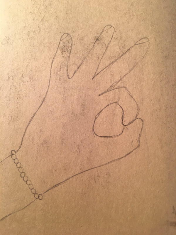
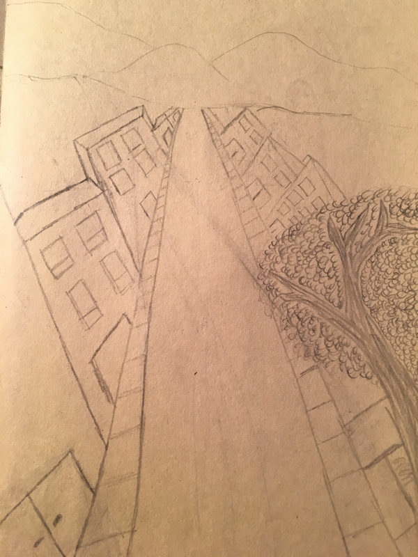
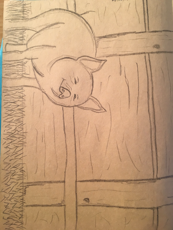
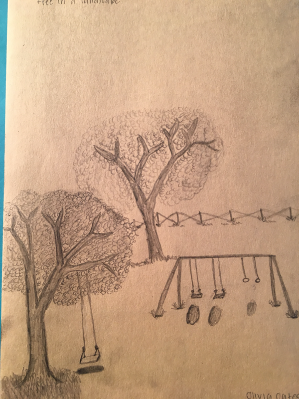
These are my first four drawings from the beginning of art 2. We had to draw a tree scene, an animal, our hand and a street scene.
